The Brand Board: Your Brand Identity’s Essential Visual Reference
- Jessica Plant
- Jun 13, 2023
- 5 min read

Updated: Jan 28, 2025
Today there are many ways your brand is introduced to the world. Social media channels, your website, and even your business card are an extension of your brand identity (and yes, a business card is still relevant!). This is why having a one-size-fits-all logo design just doesn't cut it for the multitude of marketing applications.

To create a cohesive and streamlined brand identity you need more than one single asset to represent your business. Think of your brand strategy and by extension, your brand's identity as an ecosystem that brings together your values, vision, voice, and visuals to create a well-rounded brand that consumers connect with across all channels.
When developing a brand identity, one of the most important components of the design process is your brand board.
But What Exactly is a Brand Board?
A brand board is a visual reference tool that compiles all of your identity elements at a glance, from logos and colours to patterns and typography.
Think of it as your identity cheat sheet — a single-page resource for you to refer back to when creating any kind of marketing piece, whether online or offline.
How Does a Brand Board Differ From a Brand Style Guide?
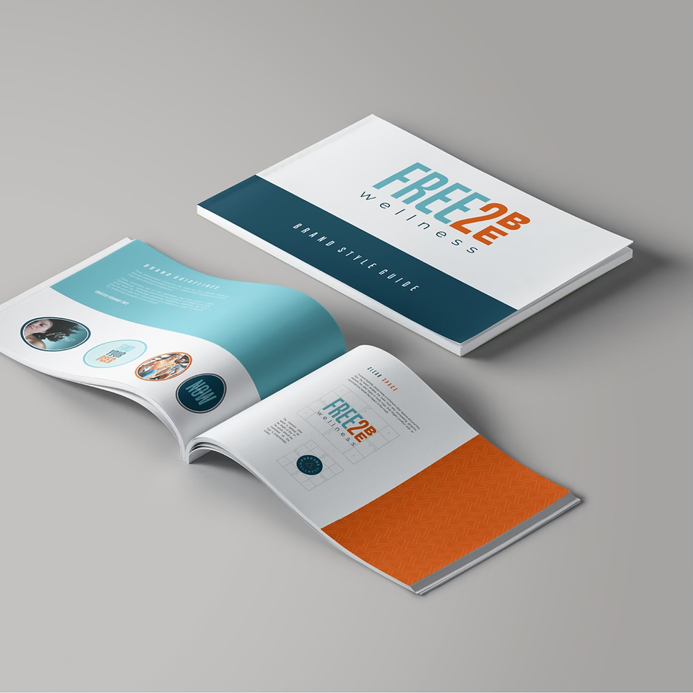
A brand style guide, brand guidelines, or what we here at The Brand Brew ® affectionately refer to as your Brand Bible, is a more in-depth version of your brand board. The 12-page carefully-designed manual includes a comprehensive list of your brand identity rules and regulations, such as primary and secondary logos, colour palette reference and use, complete font systems, brand patterns, in-use renderings, and, where applicable, reference to your mood board and brand photography.

What is a mood board, you ask?
It’s a fluid visualization of your brand compared to a brand board, used earlier in the strategic process to inspire creativity and kickstart your brand identity brainstorming.
Read all about mood boards and how they contribute to The Brand Brew ® branding process!
How the Brand Board Benefits Your Business
A brand board saves you the time, energy, and people-power necessary to sustain brand consistency (and consistency is key, after all!). You should only be using these strategically selected colours, fonts, and graphic elements in order to establish brand authority and recognition. Otherwise, your brand might look like a jumbled hot mess and confuse your audience. No, thank you!
When onboarding a new team member or hiring a marketing agency (like The Brand Brew ®), a brand board will keep all stakeholders on track by removing the guesswork and providing a clear guide for which elements, logos, colours, and fonts to use when developing marketing materials.
Anatomy Of Your Brand Board
It’s common for a brand identity to have several “lock-ups,” or official arrangements of the logo and brand elements. This way, the right brand asset can be used to fill the available space. A website header might be a good place for your primary logo if it's a long, horizontal lock-up. Maybe your secondary logo is a stacked, centred version that fits effortlessly on a vertical banner at a trade show. Often, the proportion between the symbol and the wordmark changes to create a harmonious, balanced grouping.
Let’s break down each component and its possible uses so you can use every element of your brand’s visual identity with confidence.
Primary Logo Your primary logo is your preferred asset. When space allows, this is your go-to logomark. This logo can be displayed on everything that represents your business, including but not limited to your website, business cards, letterhead, packaging, promotional products, and merchandise. |  |
Secondary (Variation) Logo A secondary logo is a variation of your primary logo. This mark takes a different format (ie: stacked if your primary is horizontal or vice versa) yet maintains the same important elements. This logo will be used whenever the primary logo does not fit. Some of our favourite applications are your website, email signature, and merchandise. |  |
Brand Mark The brand mark should be highly versatile and simplistic. This icon-based asset is ideal for small spaces where your primary or secondary logos would become unrecognizable, for instance as a favicon, app icon, or social media profile image. |  |
Wordmark This text-based logo is another variation to use when space cannot accommodate the brand's primary logo. The wordmark allows you to show the brand's name alone without including the brand mark or tagline. We often use the wordmark on social media assets, website footers, and various printed goods to add variety and avoid duplication. |  |
Submark A submark has a more simplistic design with somewhat proportionate dimensions, making it ideal to use on social media as a watermark or stamp. This asset might include the brand name, initials, tagline, and/or brand mark. |  |
Colour Palette Formed based on your brand personality, target market, and colour theory, the palette consists of five (5) coordinating hues or tints to make up your brand’s primary and secondary colours. Colour-matching is easy between your print and digital marketing materials as each hue is provided as a Pantone, CMYK breakdown, and HEX value. |  |
Typography We aim for three (3) typesets, including a hero font for headings, a highly legible font for large areas of copy (like paragraphs) and an accent font for subheads or quotes. These fonts should not be altered, except to be used in italics or bolded for certain emphases within designs. |  |
Patterns & Textures Some, but not all, visual identities include patterns and textures that are rich, sensory, and tileable to reinforce the mood and theme of the other brand elements. These assets make great backgrounds for business cards, letterhead, presentation folders, social media posts, or website sections, to name a few. |  |
Social & Web Signatures These brand assets are recognizable and stylistic elements that embody a company's social @handle and website URL. Common applications are used on business cards, stationery, social media, and in your email signature. |  |
In-Use Renderings The Brand Brew ® brand board includes a collection of key branded mock-ups tailored to your niche to help you understand how the strong strategy and visual identity will live out in the world, across multiple mediums. |  |
Cohesive brand visuals are key to getting noticed and recognized across all channels, ultimately strengthening your brand credibility and building trust and rapport with your audience.
If you just have a single logo or no brand identity at all, The Brand Brew ® Brand Development strengthens your company's presence in a competitive market with a comprehensive brand strategy and asset toolkit, including primary and variation logos, brand mark, submark, colour palette, typography, and online signatures, all delivered on the essential brand board.


Comments