
Farley Foundation
Brand & Website Redevelopment
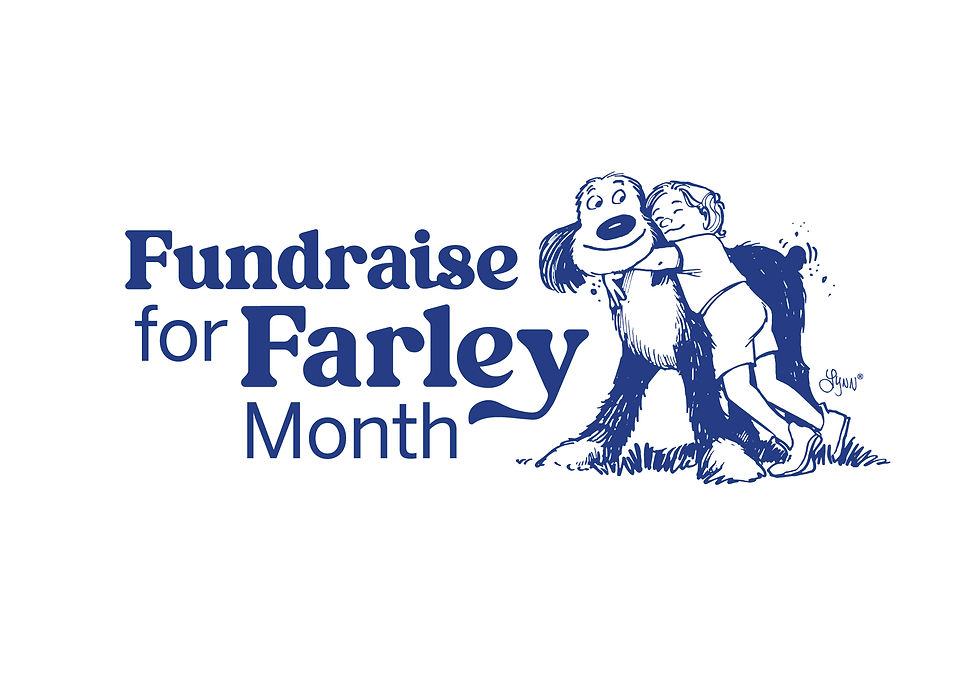
The Farley Foundation is dedicated to compassion, care, and improving the lives of pets in need. As a trusted charitable organization, it provides essential veterinary support for the animals of people facing financial hardship—ensuring that love, not cost, determines the care a pet receives.
The Challenge
Clarify the brand identity to ensure all elements—colour palette, fonts, and guidelines—work cohesively across all touchpoints, including sub-brands and events.
Elevate the visual impact by modernizing the logo typography, introducing a bolder, more creative colour palette, and determining the right level of connection to OVMA.
Refine brand recognition and messaging to increase awareness beyond the veterinary industry, clearly communicate the mission to those unfamiliar with “Farley,” and create a more approachable, memorable presence.
The Strategy
The Farley Foundation’s colour palette is a lively, approachable blend that balances warmth and trust. The signature blue anchors the brand in reliability and compassion, while coral infuses it with energy, optimism, and heart. Teal introduces a sense of renewal and healing, and bright yellow adds a joyful spark—symbolizing hope for pets and the people who love them. Together, these colours reflect the Foundation’s friendly, supportive spirit and its mission to make a positive difference in every life it touches.

The Result
The updated Farley Foundation logo features the beloved Farley face illustration, offering a simplified yet more impactful visual than the original full-sitting dog. This streamlined approach creates a stronger, more iconic lockup that preserves instant name recognition.


The typography blends a nostalgic serif with a clean, modern sans serif—bridging the brand’s rich history with its bright future. Friendly, curved letterforms, including the “y’s playful tail-like descender, bring warmth and personality while subtly supporting the word “Foundation.” The result is a primary mark that’s approachable, memorable, and comforting—perfectly embodying the heart of the Farley Foundation.


The Takeaway
With the Farley Foundation's brand strategy in place, each touchpoint rolls out with purpose and consistency. They now feel confident that their brand resonates with their market and secures a strong foundation in the marketplace.

